How to View Affiliate Creative Performance in CJ Affiliate

Providing affiliates with plethora of creatives is essential for any affiliate program. The creatives could be banners, text links, coupons/deals, and videos; but providing as many as possible is advantageous for any affiliate program. Having a wide selection of creatives is great, but how do affiliate managers know the top converting ones and what new ones should be introduced? Affiliate networks provide merchants (and affiliate managers) access to important data regarding their creatives. This data helps determine what creatives to keep creating in the future and what ones to discontinue, but will also tell the needed statistics like clicks, revenue, etc.  CJ Affiliate is one of the networks that provides in-depth data on how specific creatives are performing. The following steps will show affiliate managers how to view affiliate creative performance in CJ Affiliate.

Step 1 – Click “Performance” under the Reports Tab

Once logged in to the CJ Affiliate merchant interface, navigate to the “Reports” tab and click “Performance” from the drop-down menu.

Step 2 – Filter Performance by Link

After clicking on “Performance” in the reports tab the next screen will allow affiliate managers to sort performance by links. Under “Performance by” click the drop-down box, select “Link” and then either hit “Run Report” or add a specific “Link ID” to the box. By not adding a link ID it will generate a report with all the creatives in the inventory, but by specifying a specific link it will only show data for that one.

Step 3 – Review Performance of Current Creatives

Each creative (banner or link) will have the following information available to analyze: publisher commission, total commission (includes CJ Affiliate’s fees), sale amount, number of sales, leads (if applicable), items, clicks, impressions, conversion rate, click through rate, and EPC (earnings per 100 clicks).

Whether it is just checking the performance of banners and links for basic knowledge or using the data to build a top-notch creative inventory affiliates can use to grow your affiliate program and their earnings, the data is extremely helpful. Finding out the best converting links (or deals) and banners will help make the affiliate program an affiliate friendly program that will be fruitful for all parties involved.

How to View Affiliate Banner Performance in ShareASale

As a merchant you are always looking for ways to improve the performance of your affiliate program and monitoring reports and trends are essential.  What reports should you be reviewing to ensure optimal performance? The transaction report, weekly report, affiliate timespan report, and banner performance report are among the most popular reports (in ShareASale). Today, I will be providing a step-by-step guide to review the banner performance report in ShareASale. This report tells you (the merchant) what banners/links/deals are most popular among your affiliates. So without any further ado I will begin.

Step # 1 – Click the “Banner Performance” icon under the “REPORTS” tab

The banner performance report is under the “Reports” tab along with the other reports important for managing your program. Once you click the “Banner Performance” icon you will be taken to the next screen where you can filter your data in many ways.

SaS 1

Step # 2 – Select your data segments

This step is where you select what data to include in the report. You want to select a date range to analyze first. ShareASale only allows you to review a 30-day period at once. You also have the option to segment it by creative types (banners, links or deals) and by commissions paid, sales generated, and number of clicks. To view the data within the ShareASale interface, click the “Refresh Report” button and you will be provided the data you requested via the filters used. Lastly, to create a downloadable text version make sure to “check” the box labeled so. To open the document in excel please read this article How to View ShareASale Pipe-Delimited File in Excel Columns

SaS 2

Step # 3 – Review banner/link data

You will see the banner/link ID’s are on the far left side of the page and then you have the banner type, the amount of clicks (unique) it received, the commission earned, the total sales generated, number of sales, and voids.  You may not know exactly what link is what, so you have to preview it and determine if it was a banner, text link, coupon, etc.

SaS 3

Step # 4 – Preview banners/links

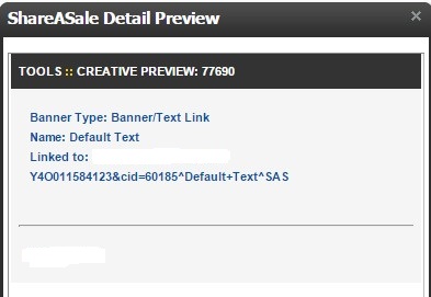
To preview the banner/link in question click the square icon next to the banner ID. A pop-up will appear on your screen (similar to the one below) and it will tell you if it is a banner or a text link and any other details you may need to know including a preview of the banner and text link. For the purposes of this post I removed sensitive client information, but the idea and logic is the same.

SaS 4

Understanding how your creatives are performing is important because it will help you determine if you need more of a particular banner and it also lets you know what type of creative your affiliates prefer so that you can offer them what they will use. Creating banners and text link without knowing if they will be used is a waste of time and resources, so be sure to review the “banner performance” report on a monthly basis.

Adding Affiliate Creatives to ShareASale: Step-By-Step Guide

Having a good selection of creatives for your affiliates to use is important. Banner ads and text links are the two most common forms of creatives given to affiliates to market products/services. Designing them and making them affiliate friendly is one thing, but how do you make them available to affiliates? I will show you a step-by-step guide to uploading banners and text links in ShareASale.

Step 1 –  Locating the My Creatives tab

After logging into to your ShareASale merchant account you want to locate the “My Creatives” tab on the top navigation.

SaS Creative 1

Step 2 – Select Add Creative

You will need to hover your mouse over the “My Creatives” tab, it will provide a drop down menu. The drop down menu will show the various options like “Add Creative”, “View Creative Inventory”, “Post Coupon Deals”, etc. You want to click on “Add Creative”. You will then be directed to the page where you can start uploading your newly created banners/text links.

SaS Creative 2

Step 3 – Uploading Banners

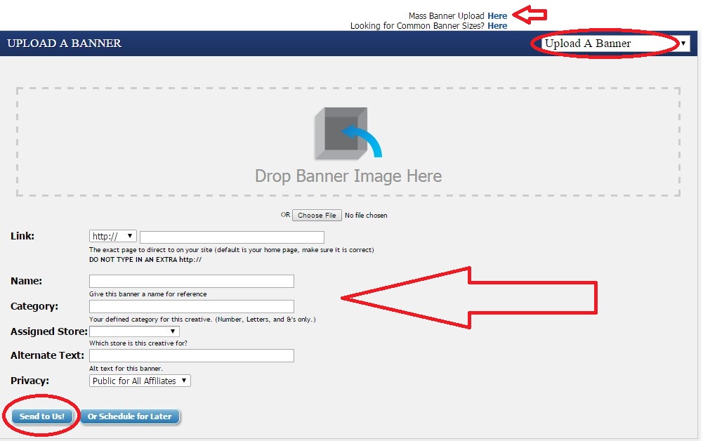
Whether you are uploading one banner or one hundred it is still a straight-forward process. ShareASale has made uploading banners extremely easy. Make sure that you are on the “Upload Banner” page and then you can either drag and drop the banner where it directs you or you can choose the file from your computer. If you want to upload multiple banners at once ShareASale has a “Mass Banner Upload” option that will save you time. Next, you will want to add the URL to where the banner will be linked, provide a name for the banner, assign a category, add alternative text (if applicable), and set the privacy option. The privacy option allows you to make the banner(s) public to all affiliates or to select affiliates of your choice. Once complete hit “Send to Us” and it will be ready for affiliates to use.

SaS Creative 3

Step 4 – Uploading Text Links

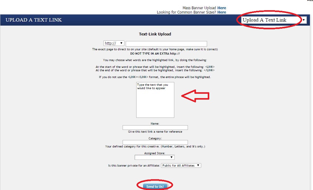
This is a very similar process to uploading banners. Make sure you are on the “Upload a Text Link” page. There is a drop-down box to toggle between uploading banners and text links. First, add the URL where the text link is going to be directed to. In the square you want to put exactly what you want your text link to say (i.e. 50% Off Widgets). As with uploading banners you want to name the link, assign it a category and set your privacy settings (i.e. public to all affiliates or specific ones). Once all the details of the text link have been added click “Send to Us” and it will be available in your creative inventory.

SaS Creative 4

Step 5 – Check Uploaded Banners/Text Links

Once you have uploaded all your banners and text links you should check to make sure they loaded properly.  On the top navigation you want to click “My Creatives” and then “View Creative Inventory”. From there scroll down and you will see two tabs titled “Banners” and Text Links”. This will tell you how many banners and text links you have.

ScreenHunter_423 Feb. 05 10.44

There you have it, a quick guide to uploading banners and text links in ShareASale. It is not difficult, but if you are not familiar with the interface it can be time consuming and tedious. Providing a thorough inventory of banners and text links is essential, therefore, knowing the most popular sizes to create is imperative. Want to know the most popular affiliate banner sizes? Check out my post on affiliate banner ads.


5 Common Affiliate Banner Mistakes to Avoid

On December 19, 2014 I wrote a post that discussed affiliate banner ads, more specifically requirements, sizes, and examples of affiliate banners. With my first post of 2015 I would like to discuss 5 of the most common mistakes (I see) made when creating affiliate banners. The mistakes that are going to be discussed are ones seen most often when working with merchants and can be the difference for an affiliate to use a competitor’s banner ad.

Mistake # 1 – Poor Graphics

This one in particular can be the difference for an affiliate to market a competitor’s product. Graphics should be clear and not pixelated. Merchants should be sure that the version of the graphic they are using is high quality and looks good on the created banner.

Mistake # 2 – Font Unreadable

This is one mistake I see way too often. Why would you include text on a banner when it is not legible? Font that is either too small or blurry will do more harm than good, in fact it may hurt the conversion rate. If you want to include a tagline or some other text on banners that is fine, but including it on small banners (i.e. 88×31) is not recommended.

Mistake # 3 – Brand Not Included

How are the potential customers supposed know who the product is being marketed by? Including the brand should be a top priority and should never be omitted. In my time managing affiliate programs I have seen this mistake more than I would like to, so never forget to include your brand name/logo.

Mistake # 4 – No Call to Action

A clear call to action is a must for all affiliate banners. Do not assume that visitor knows to click the banner, so ASK them by including the appropriate call to action. Examples of calls to action include: Shop Now, Click Here, and Learn More.

Mistake # 5 – Missing a Border  

This is by far the most common mistake I see when merchants create affiliate banners. The banners can include amazing graphics, a concise message, and a call to action, but are missing a small, yet important detail: a border.

Banners created with white or very light backgrounds get lost in the white backgrounds of affiliate sites. Be sure to include a 1 pixel line around the border of all affiliate banners to ensure your banners stand out.

If you avoid making the 5 common mistakes referenced you will have quality affiliate banners that affiliates will be proud to display on their sites. Affiliate banners are another marketing tool, so make sure they represent your brand in the way you want.

Affiliate Banner Ads: Requirements, Sizes, Examples

Banners are an integral part of any affiliate program, but in some instances merchants do not understand how important they really are. Banners and text links make up an affiliate programs creative inventory that affiliates used to promote merchants products or services. Affiliates use them in a variety of ways and require them in multiple sizes.

When we at AM Navigator either take over management of an existing affiliate program or start one from scratch banners are among the most popular issues/topics we discuss with clients. In a few instances I have seen banners not include a sales message or a call to action; so what is the visitor supposed to do? The key is to make the banners entice the visitor to click and buy. Many merchants are unsure of the protocol for creating affiliate banners, including the key elements to an effective affiliate banner and the sizes they should create. Examples of quality affiliates banners can be found by clicking here.

I will go over the 3 main elements an affiliate banner requires and provide a list of banner sizes (and quantities) that we recommended when running an affiliate program.

All affiliate banners require three elements:

1.       Clear Visual Elements

2.       Concise Message

3.       Call to Action

Without the three above elements the banners will not be attractive to affiliates and they will not convert.

Affiliate banner size recommendations (with recommended quantities):

88×31 px button – 2-5
468×60 px – 2-5
125×125 px – 2-5
120×600 px – 2-5

160×600 px – 2-3
120×240 px – 2-3
234×60 px – 2-3
254×331 px – 2-3
728×90 px – 2-3
250×250 px – 2-3

720×300 px – 1-2
300×100 – 1-2
300×250 px – 1-2
180×150 – 1-2

The banner sizes above are broken into 3 groups based on demand from affiliates. Even though the list includes all the most popular sizes, affiliates may still have special requests for custom sizes, so you must be ready to create additional ones that may include different color schemes and images.

The 88×31 is by far the most popular size among affiliates because it can be used in different ways. It is the most popular with coupon/deal oriented affiliates. We recommend having at least 2 created in different styles.

Affiliate banner creation should be taken seriously and include the 3 elements outlined above and most of the sizes discussed. Without quality banners available to affiliates, the less likely they may be to promote your product/service. Next week I will discuss mistakes to avoid when creating affiliate banners.

Affiliate Text Links vs. Banners – The Great Debate

I am asked regularly by clients what types of links are best for their affiliate program and I give the same answer, it depends. What do I mean it depends? Every affiliate promotes a merchant differently. For example, some use text links embedded within content, while others prefer banner ads to help convert traffic from their site. I would never say go with one over the other, as both are essential to the growth of an affiliate program, but I would do an analysis of your current creative inventory and see what links and banners are being used more frequently and supply your affiliates accordingly. If you are thinking of starting an affiliate program then I would say have both text links and the most popular banner sizes available for affiliates.

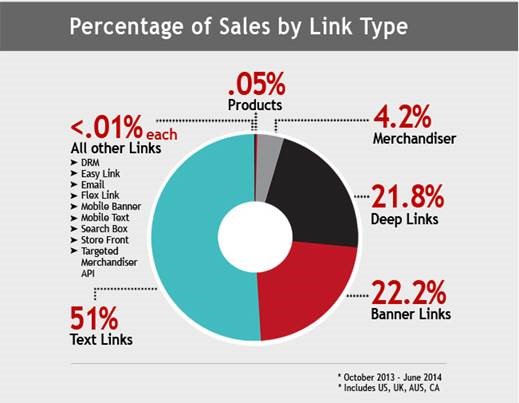
Rakuten Marketing conducted a link performance report across the Rakuten Affiliate Network from October 2013 – June 2014 to see what types of links are most effective for merchants. Please note that this data is specific to Rakuten Affiliate Network and could vary depending on the network.

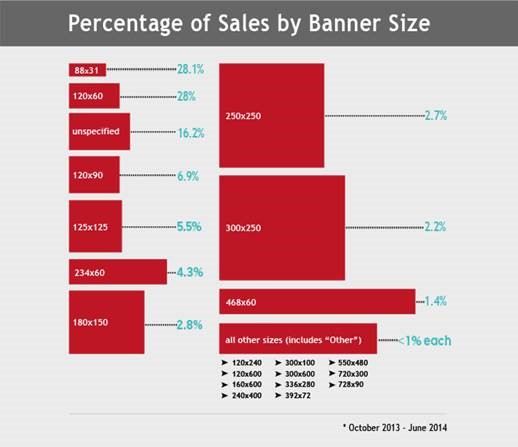
The report from Rakuten Marketing provided the percentage of sales by link type and the percentage of sales by banner size. They found that 51% of sales occurred using a text link and another 22% using banner links. Does this mean you should not offer any banners or even decrease the amount in your creative inventory? Absolutely not! Offering affiliates a selection of the most popular banners will do, but be prepared to create additional banners if an affiliate requests a size not currently available.

Sales by Link Type

According to Rakuten Marketing, over 56% of all sales from banner links resided from two sizes in particular. The 88×31 (28.1%) and 120×60 (28%) were by far the most popular for affiliates and also generated the most sales. Both the 88×31 and 120×60 banners are popular among coupon and deal oriented affiliates as are text links, but text links are also very popular among content affiliates.

Sales by Banner Size

When deciding how to stock your creative inventory it is wise to provide the most popular banner sizes (88×31, 120×60, 125×125, 300×250) and create text links that include your brand name and all coupons/deals and popular keywords associated with your brand. By equipping your affiliates with the most popular creatives it will save time creating banners that will never be used by affiliates.